
Need a boost?
Your business
deserves a
creative partner!
Logo need an update? Website struggles? Materials out of date? Where do you start?
Let’s make a plan.
We’ll tell your unique story. You’ll really stand out, and we promise it won’t be complicated.


Real Estate
: :
Organizations
: :
Restaurants
: :
Not-for-Profits
: :
Retail
: :
Real Estate : : Organizations : : Restaurants : : Not-for-Profits : : Retail : :


Creative that means business.
Logo Design + Branding
Social Media Content
Custom Illustration
Layout
Marketing Strategy
Photography + Video
Motion Graphics
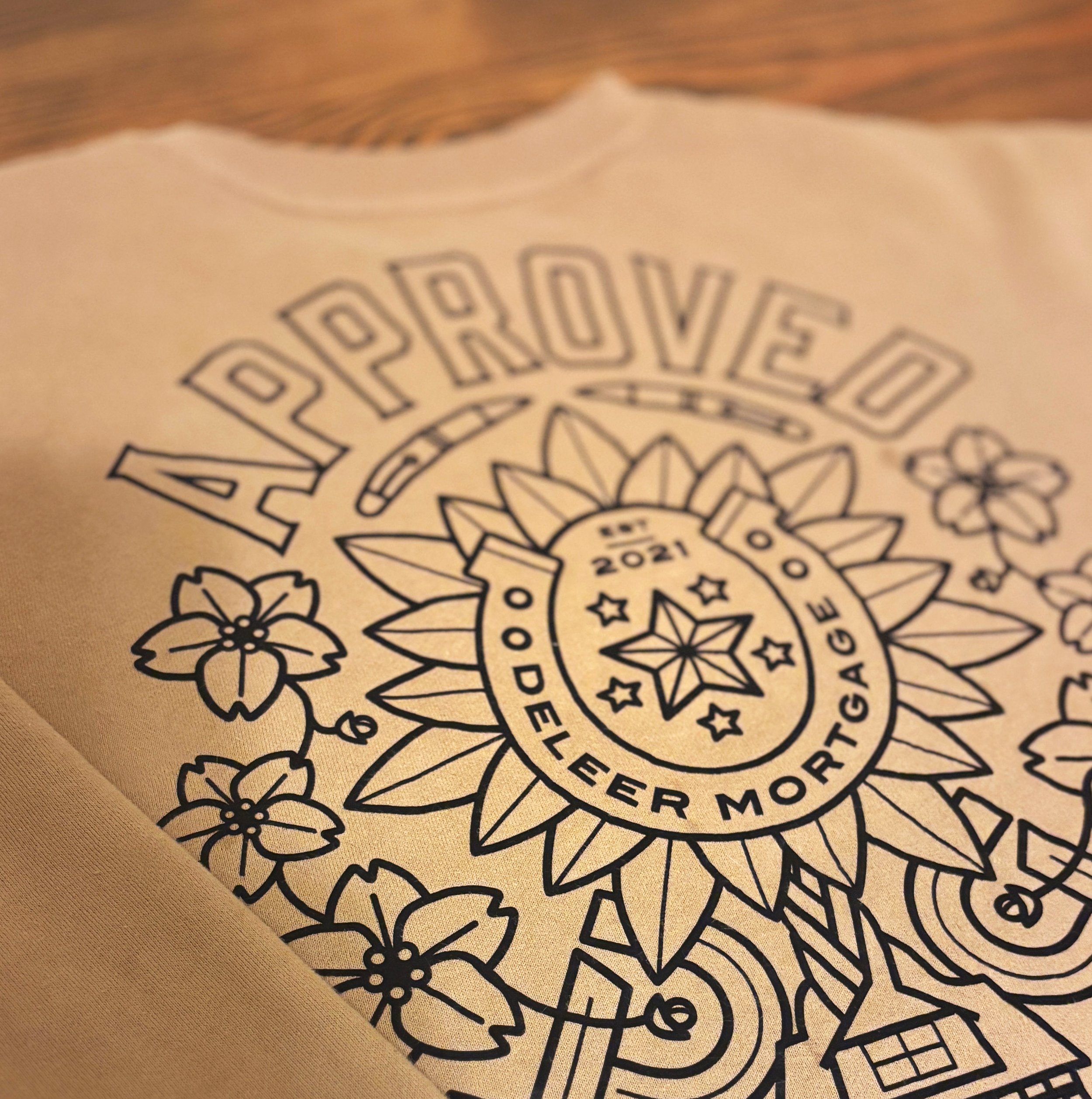
Apparel and Swag
Printing Services
Packaging and more!
At Spotvin, we believe that businesses of every size should have access to the best quality design and creative.
Whether you’re a start-up looking for launch materials for a brilliant product, a restaurant cooking up a fresh new location or an organization who needs ongoing assistance to shine in your industry. Whatever it is, we got you.
We are a team of designers, project managers, marketers, videographers, writers, entrepreneurs and business owners like you. With over 20 years of experience with all types of business, we’ve learned to listen, work efficiently and deliver products that are clever, strategic and unique.
We also offer simple billing structures so you don’t have to worry about any surprises and can budget accordingly.
Check out some samples of our work here or contact us anytime.
Proudly located in Windsor, Ontario.

this is a line
Real design for everyday.
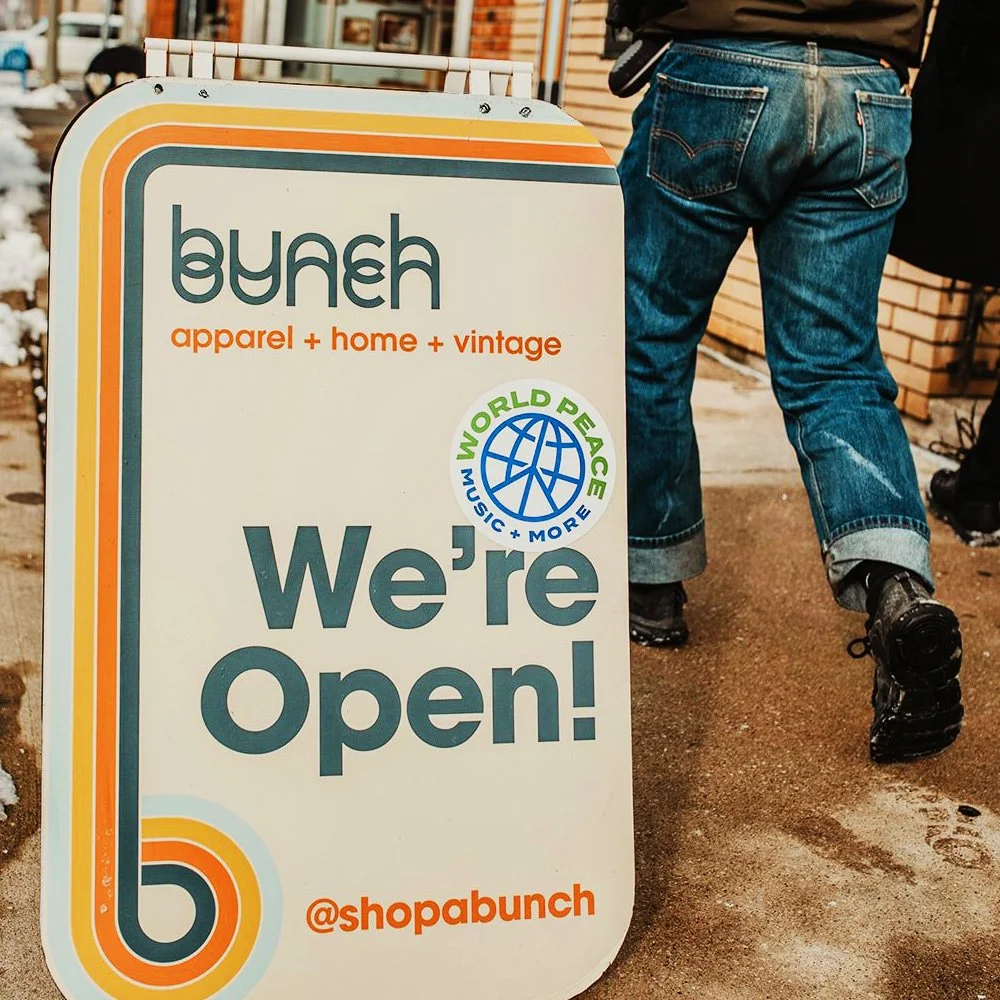
Outdoor Signage
Logos

Social Media
Print Material
Apparel
Menus
this is a line
Let’s keep this simple.
We offer convenient straightforward creative solutions geared towards every type of business.

Launch
Creative Audit
Logo + Branding Package
Website
Marketing Materials
Indoor + Outdoor Signage Design
Social Media Guide
Apparel Design
Bi-Weekly Creative Strategy Check-in
Trade Printing Discounts
Signage Discounts

Ignite
Creative Audit
Marketing Materials
Indoor + Outdoor Signage
Social Media Guide
Apparel Design
Monthly Creative Strategy Check-in
Trade Printing Discounts
Video + Photography Discounts

Charge
Creative Audit
Marketing Materials
Social Media Guide
Monthly Creative Strategy Check-in
Trade Printing Discounts
Video + Photography Discounts
Please reach out, we’d be happy to give you a quote for your project. Monthly plans are also available.
Contact us.
*Not-for-profits and charities receive an extra 15% discount on all services.
We’ve got some happy clients :)
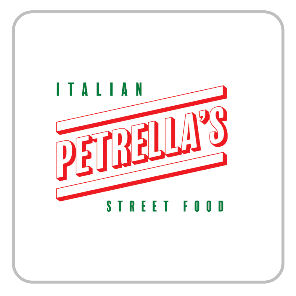
“Every small business owner knows how challenging the journey can be. With Spotvin, you get A-list service—their passion and commitment comes through in every project, big or small. Your success drives them. You can trust that your dedication is matched by their team.”
— Rino, Petrella’s Italian Street Food
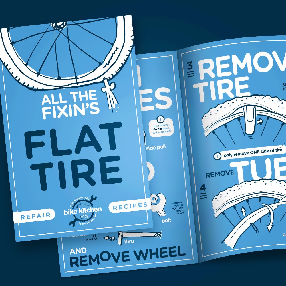
“Spotvin is our go-to for smart, creative marketing materials. For more than a decade, they’ve delivered catchy branding for our print and online needs. They are efficient, respects our budget limitations, and he always makes us look great. “
— Lori Newton, Director of Bike Windsor Essex